Want to make a sticky header with CSS?
No problem.
You simply add this CSS to your header HTML:
header {
  position: sticky;
  top: 0;
}
In this article, we’ll dive in deeper to create a CSS sticky header from scratch. You’ll also learn how you can do it in WordPress.
Let’s dive in.
Create an HTML and CSS Sticky Header
Sticky headers will stick to the top of the browser when people scroll down the page. This is great for keeping your sticky navigation menu on display at all times, providing a better user experience.
Let’s look at the code.
HTML
This is a basic example of the HTML:
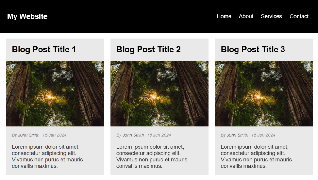
<header>
  <h1>My Website</h1>
  <nav>
    <ul>
      <li><a href="#">Home</a></li>
      <li><a href="#">About</a></li>
      <li><a href="#">Services</a></li>
      <li><a href="#">Contact</a></li>
    </ul>
  </nav>
</header>
The main container is a <header> and it has a simple <h1> for the logo and a <nav> for the navigation menu.
The important element is the <header> as this is what we’ll assign the CSS to to make it sticky. What goes inside this element is up to you; the fixed header will stay the same.
We’ll add more HTML and CSS later to add some style and to see the CSS sticky header scroll in action.
CSS
Now let’s look at the CSS again:
header {
  position: -webkit-sticky; /* Safari */
  position: sticky;
  top: 0;
}
We can target the header section with header { } and add the CSS position element with the sticky property and top: 0 to make it stick to the top of the page.
We can also add position: -webkit-sticky for Safari browser support and older browsers.
Position: sticky works by combining position: relative and position: fixed together. That means the element will act like a relative element until the user starts scrolling. Then it stays fixed to the top or however many pixels you define with top: 0.
Here is some more code to add more style to the header. This will add text and background color, add some padding, and align the logo and navigation.
header {
  position: -webkit-sticky; /* Safari */
  position: sticky;
  top: 0;
  background-color: #000;
  color: #fff;
  padding: 25px;
  display: flex;
  justify-content: space-between;
  align-items: center;
}
Here’s the final header CSS together, which we’ll explain further in the post:
header {
  position: -webkit-sticky; /* Safari */
  position: sticky;
  top: 0;
  background-color: #000;
  color: #fff;
  padding: 25px;
  display: flex;
  justify-content: space-between;
  align-items: center;
  transition: padding 0.3s ease;
}
header.scrolled {
  padding: 5px 25px; /* Adjusted padding when scrolled */
}
header h1 {
  margin: 0;
  padding: 0;
  font-size: 24px;
  text-align: center;
}
nav ul {
  list-style: none;
  padding: 0;
  text-align: center;
}
nav ul li {
  display: inline;
  margin: 0 10px;
}
nav ul li a {
  color: #fff;
  text-decoration: none;
}
nav ul li a:hover {
  text-decoration: underline;
}
JS to change The Height on Scroll
Want to make the header reduce in size when you scroll?
No problem.
Here’s some JavaScript to make it work:
window.addEventListener('scroll', function() {
 // Select your header
 var header = document.querySelector('header');

 // Check if the scroll position is greater than 50 pixels
 if (window.scrollY > 50) {
  // Add a CSS class to reduce header size
  header.classList.add('scrolled');
 } else {
  // Remove the CSS class to restore header size
  header.classList.remove('scrolled');
 }
});
This will shrink the size of the header so that it doesn’t take up unnecessary space on the page yet keep the navigation in view.
Let’s break it down to see how it works:
window.addEventListener('scroll', function() { ... }): This is an event listener that triggers when the window is scrolled.var header = document.querySelector('header'): This line selects the header element from the HTML document and assigns the header variable, allowing it to be targeted later in the code.if (window.scrollY > 50) { ... } else { ... }: This condition checks if the vertical scroll position is greater than 50 pixels. If it is, the code inside the first block is executed; otherwise, the code inside the else block is executed.
You’ll need to add this CSS as well, as it will define the size of the header once scrolled:
header.scrolled {
  padding: 5px 25px; /* Adjusted padding when scrolled */
}
To add an effect when the header gets smaller, add this piece of CSS to the header tag:
header {
  transition: padding 0.3s ease;
}
Demo of CSS sticky header on codePen
Here’s a CodePen demo to see it all in action:
You can edit the code however you like and make it your own.
CSS For Table with Sticky Header
If you’re looking for a fixed header for tables, here’s the code for it. You can find the demo here.
It works in the same way as above by using position: sticky and top: 0, but this time, it’s assigned to the header cell.
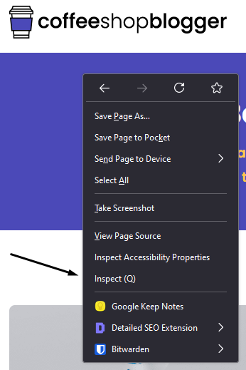
How to Make Any Header Sticky Using the Inspect Element
What if you already have a site with a header that isn’t sticky or fixed?
Whether it’s your own website or one you’re working on, you can make the header sticky using the inspect element tool.
Browsers like Chrome and Firefox have this built-in, so you can test out the code before saving it in the backend.
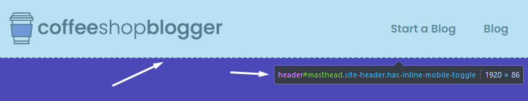
Just right-click in the browser and select Inspect Element:
Then click on the inspect icon:
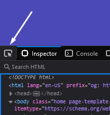
Hover over and click the header to target the element:
The element will show up in the style editor. Add the CSS code to make the header stick to the top of the page:
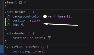
Now, your header will stay fixed when you scroll down the page. You’ll need to update this code in your main stylesheet to make it work for everyone.
CSS Sticky Header in WordPress
If your site uses WordPress, you might have a few options to make your header sticky.
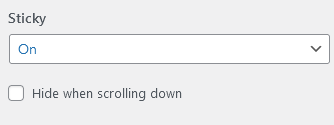
WordPress themes like Astra, OceanWP, and GeneratePress have this option available. All you have to do is activate it in the theme customizer.
Here’s what it looks like in GeneratePress:
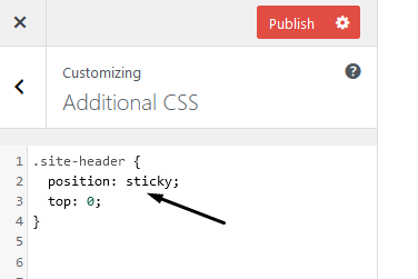
However, if your WordPress theme doesn’t support it, you can add the code above to the additional CSS inside the customizer.
If you want to shrink the header when you scroll down, you can add the above JavaScript. You’ll need to add the JS to your theme files, or you can use a plugin like Simple Custom CSS and JS.
Alternatively, you can use the WordPress plugin Sticky Menu & Sticky Header to do all the work for you.
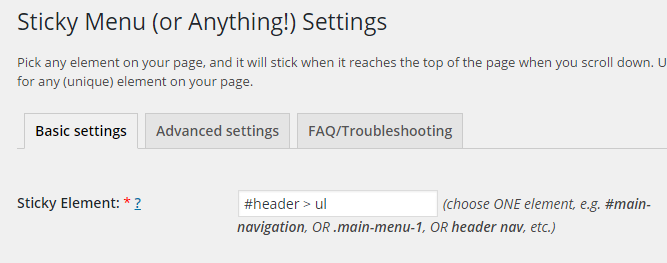
All you have to do is add the CSS property inside the plugin settings, and you’re done.
Creating a Sticky Header With CSS in Conclusion
Creating a CSS sticky header is a great way to improve user experience.
It keeps the navigation in view while people scroll down the page, providing access to important pages on your site.
This article showed you how to create a sticky header with CSS from scratch and also how to add the code to your existing header.